Note: this guide is specific to custom/static maps. Certain aspects may not apply to maps created in mapping applications such as ArcGIS.
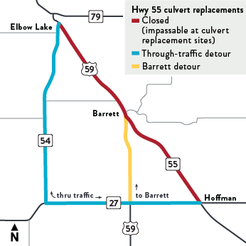
Project maps should be easy to quickly understand. Only essential information to understanding the basics of projects should be included. The objective of these maps is to show drivers where the project is located, where they can drive, and where they can't. More detailed maps can be used deeper in the site for those wanting additional information about the project(s).
The information on this page will help ensure that web maps are consistent in look, easy to understand and easier to produce.
Colors
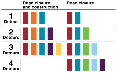
Figure 2: Sample color options for one or more detours.
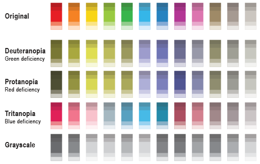
When multiple detours are used on a map it is important to choose colors that are distinctly different. Figure 3 shows how these colors are perceived by different and varying levels of color impairments.
Figure 2 shows color options for maps with one, two or three detours for maps with closures and construction and up to four detours for maps with closures only.
Remember: Always use red for closures and orange for work zones.
Color Model
PMS
CMYK
RGB
HEX
Minnesota Blue
2955 C
100 • 60 • 10 • 53
0 • 56 • 100
#003865
Minnesota Green
368 C
65 • 0 • 100 • 0
120 • 190 • 33
#78BE21
White
—
0 • 0 • 0 • 0
255 • 255 • 255
#FFFFFF
Black
Process Black
0 • 0 • 0 • 100
0 • 0 • 0
#000000
Accent Teal
3135 C
100 • 0 • 20 • 0
0 • 142 • 170
#008EAA
Accent Green
7476 C
89 • 22 • 34 • 65
13 • 82 • 87
#0D5257
Accent Orange
7600 C
0 • 78 • 83 • 55
141 • 63 • 43
#8D3F2B
Accent Purple
261 C
62 • 100 • 9 • 44
91 • 41 • 95
#5D295F
Extended Accent Blue Gray
7542 C
24 • 4 • 8 • 13
164 • 188 • 194
#A4BCC2
Extended Accent Cream
7401 C
0 • 4 • 27 • 0
245 • 225 • 164
#F5E1A4
Extended Accent Sky Blue
291 C
38 • 4 • 0 • 0
155 • 203 • 235
#9BCBEB
Extended Accent Gold
1225 C
0 • 19 • 79 • 0
255 • 200 • 69
#FFC845
Dark Gray
Cool Gray 11 C
44 • 34 • 22 • 77
83 • 86 • 90
#53565A
Medium Gray
Cool Gray 7 C
20 • 14 • 12 • 40
151 • 153 • 155
#97999B
Light Gray
Cool Gray 1 C
4 • 2 • 4 • 8
217 • 217 • 214
#D9D9D6
Red
187 C
7 • 100 • 82 • 26
166 • 25 • 46
#A6192E
Orange
152 C
0 • 66 • 100 • 0
229 • 114 • 0
#E57200
E-Z PASS
No data
112 • 39 • 132
67 • 100 • 4 • 5
#702784
Color accessibility
Color should never be the only point of differentiation. A changing the weight of the line or making a dashed line will make lines easier to differentiate and maps easier to understand.
Varying degrees of color blindness
The different ways colors are perceived by individuals makes choosing a color palette challenging. For simple maps, red, orange and blue are colors that are easy to differentiate. Complicated maps with four colors or more should be designed carefully, using figure three as a color comparison reference.
Figure 3: Perceived color values for varying levels of color blindness.
Typography
Figure 4: Map typography.
Font families should be limited to
Brandon Grotesque
Calibri (Brandon Grotesque alternative)
Times New Roman
Bold, Black, Narrow, Italic and other font variations should be used to differentiate map content and to create an appropriate hierarchy.
Road labels
Abbreviations should be used to shorten road labels when symbols aren't used or available.
Avenue = Ave
Street = St
Pine Lane = Pine Ln
County Road 11 = CR 11
Highway 12 = Hwy 12
Pine Parkway = Pine Pkwy
Grand Boulevard = Grand Blvd
Font size
Figure 5: Font size reference chart.
Type on the web appears smaller than when printed. When creating maps intended for the web, the fonts will need to be larger. The default paragraph text size on the MnDOT website is 13.6 pt. It is best to keep fonts as large as possible without over crowding map content.
Legend
The legend should include:
A title that includes the highway(s) and/or area the project is located
Construction/closure/detour marker information
Scale (when necessary)
North arrow (either in legend or elsewhere on map)
Symbols
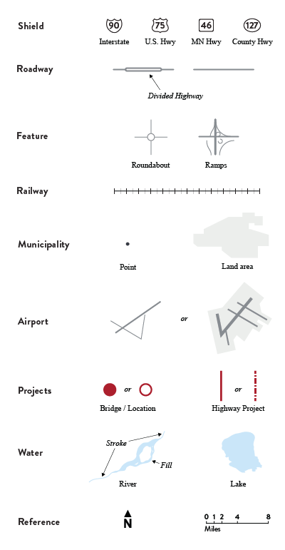
Figure 6: Map symbols.
Symbols should be used consistently to make maps easier to understand.
Map symbols
Road labels
Highway labels should use shields in the shape of real life signs, but be limited in color to black and white (white fill with a black stroke and black numbers). Street, Avenue, Drive, etc. labels should be text, use the same font as the numerals on the highway shields and be abbreviated (see Road Labels in the Typography section above).
Highways should never be labeled as trunk highways or state aid highways unless absolutely necessary to the understanding of the map.
Roads
Roads should be differentiated when necessary. Highways should only be black, dark gray or gray (from the color chart above). Note: Round caps and corners should be used to soften the look of maps and help prevent jagged edges and digital rendering flaws.
Rail
Rail lines should be symbolized by a line with cross hatches and always be black or the road color.
City
Cities and towns relevant to the project or for location reference should be marked by a black disc with a white border or the city land area should be marked with a
solid fill.
County boundary
County boundaries should always be
marked with a thin dashed line to not be confused with roads or rail lines.
District boundary
MnDOT district boundaries should only be marked when relevant to the project and should always be a solid MnDOT blue line.
State boundary
The state boundary should always be a solid black line.
Project symbols
Highway project
Highway projects should be marked with a stroke wider than the highway stroke. Red should be used for road closures and orange should be the primary
color for project locations. Dashed lines can be used for increased differentiation between projects, construction locations and detours.
Bridge project
Bridge projects should either be marked like highway projects, by a disc or with a ring, depending on the scale of the map.